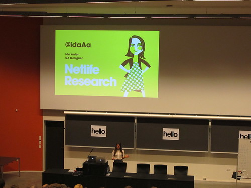
I was quite eager to hear the opening keynote for Day 2 of UX Camp CPH. Ida Aalen had flown down from Netlife Research in Norway to talk about the Core Model and share experiences in using it at the Norwegian Cancer Society, Telenor, and the Norwegian Blind Society.
I really loved Thomas’ talk the previous evening, but I think this talk topped it with its case studies, storytelling, and examples. UX in action. I do think Ida and her team grasped the idea of believing that Thomas had preached. The quality of the presentation and of the content was proof of that. If you hear about a conference where Ida is speaking, just go! And follow her on Twitter: @IdaAa. I’m a fan!
(This blog post covers only the opening keynote on Day 2. I felt it was important enough to give it its own blog post, and breaking my Day 2 notes in two might help me publish this post sooner rather than later! A later blog post will cover the sessions I attended.)
Here are my slightly cleaned up, but scribbled notes from Ida’s talk. They make most sense when you have reviewed her slides because I comment on the basis of the slides. There are also links to read at the end of my notes. This topic of the core model is definitely worth your while.
She started out her talk by saying that your website projects are about designing the home page of that website. But… surprise, surprise. By the end of her talk, she proved that you do not design for the home page at all. She showed how you look for the overlap between business objectives and user needs and design for this “Venn overlap” – the cores. If you don’t have an overlap between these objectives and needs, you’re doin’ it wrong! It also made me think of “EPPO” – the concept that every page is page one.
The core model came to the attention of the world in 2007 when her colleague, @AreGH, presented it at the IA Summit and EuroIA.
While she was talking, I quickly googled and found the A List Apart articles she mentioned:
- The Core Model: Designing inside out for better results
- The follow-up post The Core Model: Links and resources
“Who screams the loudest gets to decide.” Yup. Sigh.
Do user research and establish business objectives. AMEN!
It’s harder to protest when you have taken part in the design discussion phase.
(I made a note to connect Ida with Whitney Quesenbery because they have both done lots of work on cancer society sites in their respective countries. They did not know each other, so I feel pleased at introducing them.)
The inward path is the journey the user takes. Studying this is what makes you think more about the user and their perspective.
Interesting point about having to state something about prevention for a form of cancer even where there is no prevention. People WILL ask so if there is no information, the users will be dissatisfied and search elsewhere – and maybe get wrong info. Sometimes stating what is obvious TO YOU is important because it is not obvious to THEM.
Forward paths – where you send the user after they solve primary task.
Business objectives should be in context of the user tasks!
Keep facts and opinions clearly separate. And do this respectfully.
I like her story about changing the templates for the core model. They had one that was messy when they came out of meetings. They redesigned for mobile, but then redesigned once more. Goal: Core is same on all devices!
Content, not device, tells you about people’s situation
You google cancer because you care! 3.48 minutes spent on computer, 3.57 minutes spent on mobile. People read.
Getting more calls after redesign, but that is OK. Good point!! Some nurse said the callers are now more informed when they call in.
They didn’t care about journalists as a target audience, and now Journalists are referring to their site all the time!
So, does all this work for big business for profit? She turns to Telenor.
They had 2299 pages!!!!!!! And all thought their pages were important. Ugh.
Change is hard in big corporations!
They deleted 80% of pages on mobile broadband; sales went up 80% and support emails went down 35%!
Survey is about what’s on top of the list, but ALSO what’s on the bottom of the list. You might want to fix things if you have a business objective at bottom of user tasks.
Really fascinating to hear about her use of Statamic. You cannot publish if you don’t know the targets.
“Learn a lot about presenting design when presenting design to the blind.” @idaaa on designing for Norwegian Blind Society. There was a great photo of her presenting to some people, and one of the attendees had his head turned away. He was blind, so where he was looking was irrelevant. She said it took some getting used to.
Accessibility first! [Writing this a month after the Camp, I cannot remember where this came from. I believe Ida has a colleague who talks about this in depth in one of his talks. Ida mentioned it, but it is not in a slide. I just know I go all weak in the knees when someone acknowledges this, so I only noted the phrase and not the context.]
Ida gave us a handy link to her slides and more follow-up information to the talk.
I recently learned that Gerry McGovern’s book “The Stranger’s Long Neck” is an excellent book to read in connection with the core model that Ida presented. It’s already added to my reading list.